① Targeting the Youth Demographic, Shaping Differentiated Value through 'Golden Instinct'
Our market insights revealed that the domestic functional beverage category is overly mature and concentrated, making market fragmentation inevitable. Both trade channels and consumers were anticipating new products.
As the younger generation emerges as the mainstream consumer group, there was no functional beverage specifically designed for them. Therefore, we developed a marketing strategy for the new brand under Red Bull that aimed to counter competitors while capturing the youth market—escaping the red ocean of functional beverage competition by creating an "energy drink dedicated to young consumers."
We positioned the new brand's target demographic as the 18-30 age group—a new generation passionate about diverse entertainment cultures like sports, music, esports, nightlife, and live streaming. We discovered that when young consumers stay up late working or partying, they don't need a temporary stimulus that drains their energy, nor the subsequent feeling of being even more tired and fatigued. Instead, they require an active, positive state achieved through immediate energy replenishment.
From the company's numerous strengths, we identified an innate brand trait: As the pioneer of energy drinks, Red Bull possesses strong R&D capabilities. The innovative application of D-Ribose + Caffeine technology allows energy factors to be absorbed more directly by the body, leading to faster physical recovery.
The characteristic of faster energy release precisely helps young consumers recover energy more quickly when facing physical challenges, empowering them to fear no challenge, dare to think, and dare to act. "Fast energy release, instant better state" naturally became a clear, identifiable benefit and the brand's point of differentiated value for consumers to remember.
② Building Strong Brand Content for a Breakout Success
Guided by the 'Golden Instinct' strategy, we developed a complete core brand system around the differentiated value of "Fast energy release, instant better state," helping the brand successfully break through the noise among young consumers.
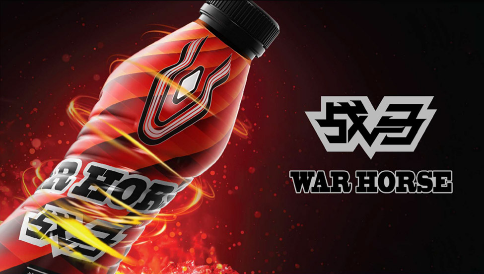
Brand Naming: WAR HORSE
We named the new brand WAR HORSE. Why WAR HORSE? The war horse was an essential tool in ancient warfare, known for its strong survival skills, ability to traverse mountains, undertake long-distance raids, charge into battle, and unleash instant bursts of energy to surprise the enemy. The WAR HORSE's robust physique, running speed, and expressive personality represent speed, endurance, and an innate instinct bred for battle. This aligns perfectly with the brand's differentiated value of "Fast energy release, instant better state." WAR HORSE makes the product function immediately clear.
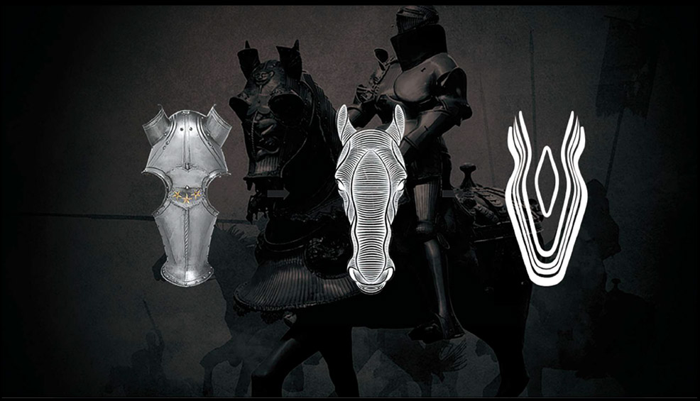
Brand Golden Symbol: Iron Steed, Silver Armor
Based on the "WAR HORSE" name, we naturally found the creative archetype for the brand's Golden Symbol—"Iron Steed, Silver Armor," representing the ancient war horse's armor. We simplified complexity, using a primal combination of lines and planes to create a distinctive geometric energy body—the Golden Symbol of WAR HORSE. This geometric energy body symbol makes the product's energy feel more concentrated, its efficacy more potent, and its release limitless.
Brand Functional Appeal: Combat Readiness, Instant Activation
The differentiated value of "Fast energy release, instant better state" directly conveys the product's energy characteristics: fast, precise, and potent. Drinking WAR HORSE means energy comes fast, meaning you have combat readiness. "Combat Readiness, Instant Activation" is the functional appeal of WAR HORSE—short, powerful, and explicitly communicating the product benefit to inspire young consumers to take initiative.
Brand Emotional Appeal: Got Energy? Bring It On!
WAR HORSE advocates for young people to have energy, dare to think and act, proactively challenge themselves, and be fearless. Therefore, "Got Energy? Bring It On!" serves as WAR HORSE's emotional connection with consumers at the brand level, resonating with young people's frequency on an emotional level. This enhances brand value recognition and effective communication, strengthening the brand imprint as the energy drink specifically for young consumers.
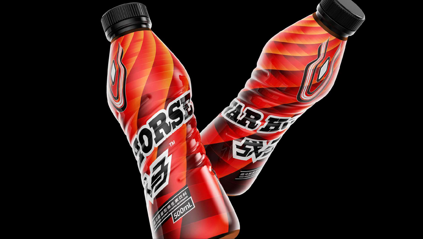
Packaging is the brand's most direct marketing tool. We integrated the "WAR HORSE name + the 'Iron Steed, Silver Armor' Golden Symbol + vibrant, bright colors representing energy," using intersecting energy lines to outline the packaging design of the WAR HORSE energy drink. This conveyed a more distinctive visual identity. Upon launch, the product was highly popular among young consumers.
At the end of 2016, WAR HORSE launched trial sales in parts of Jiangsu, Henan, Anhui, Jilin, and Liaoning provinces, generating significant market response. In March 2017, WAR HORSE fully initiated market promotion, quickly sparking widespread buzz. By 2019, within just three years, WAR HORSE had become a veritable "dark horse contender" in the functional beverage industry.