- Project Soko
- Client Haiying
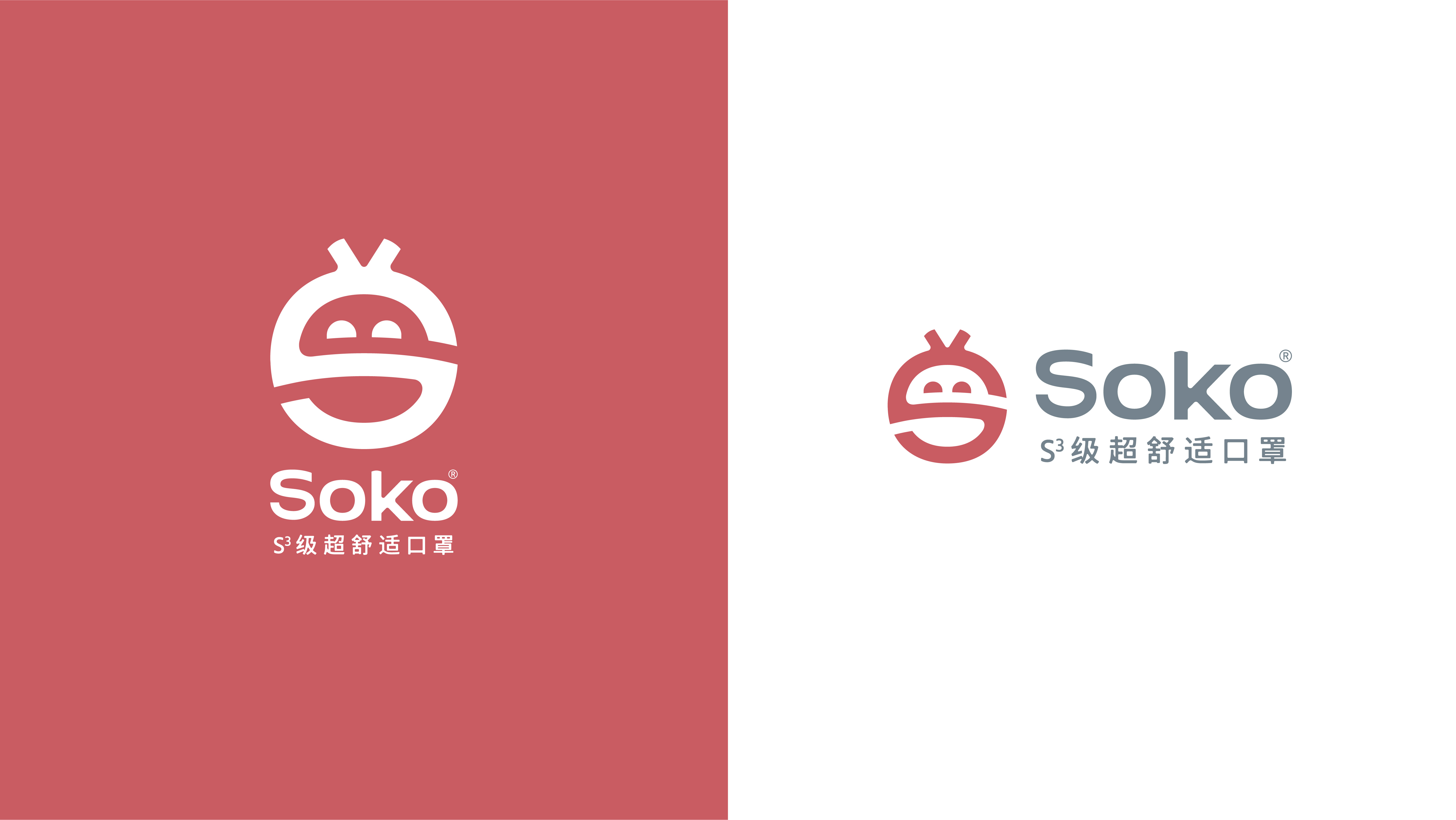
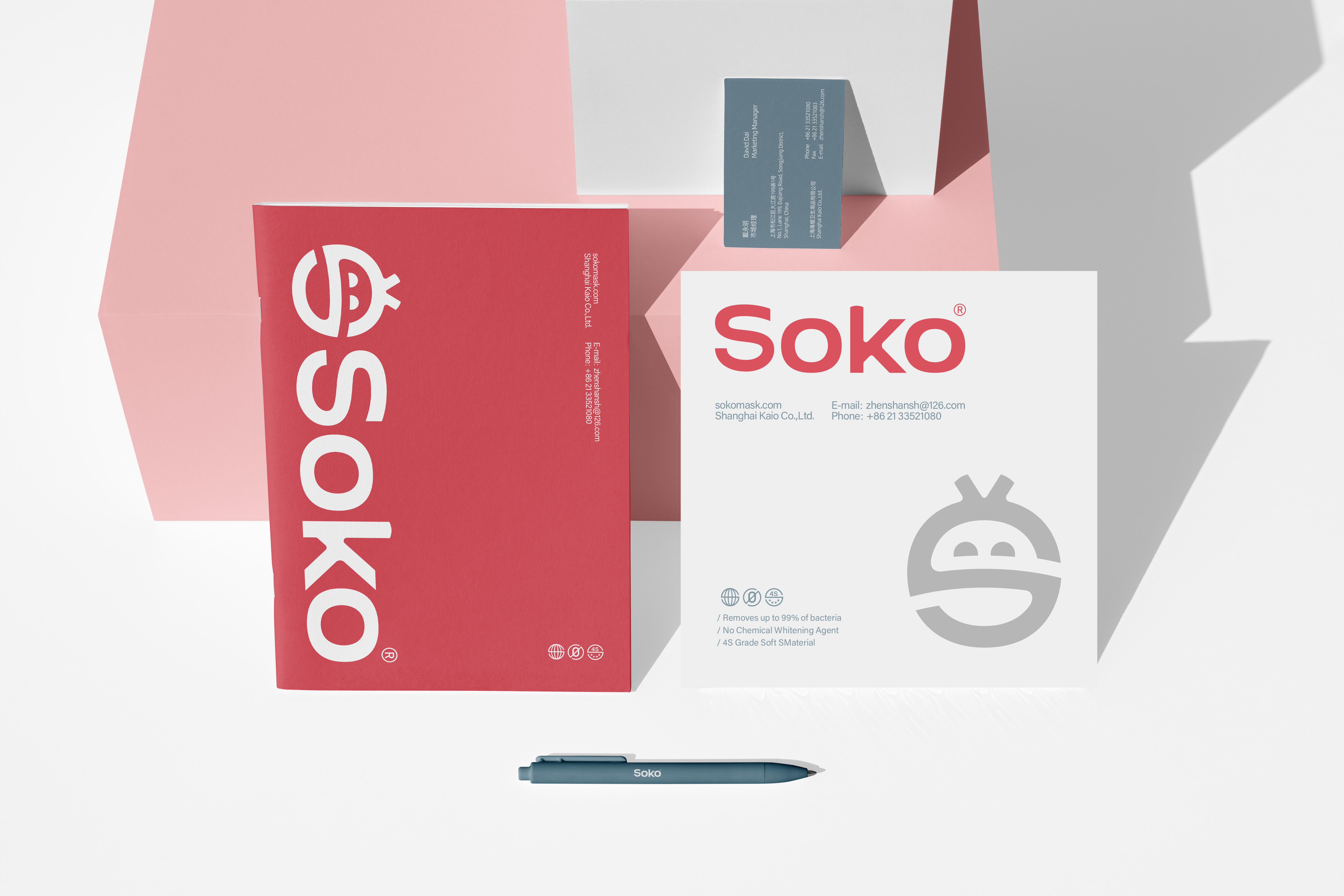
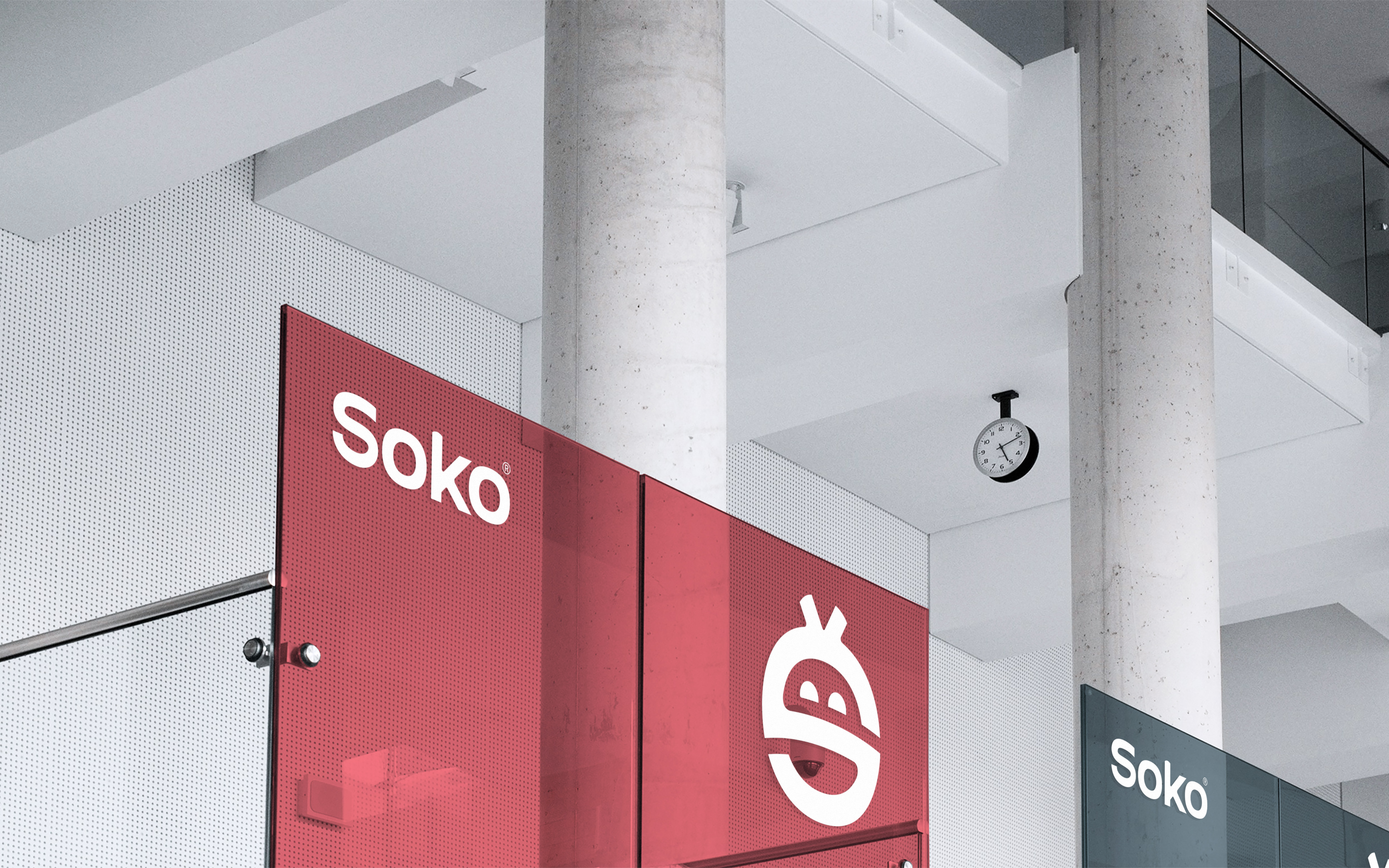
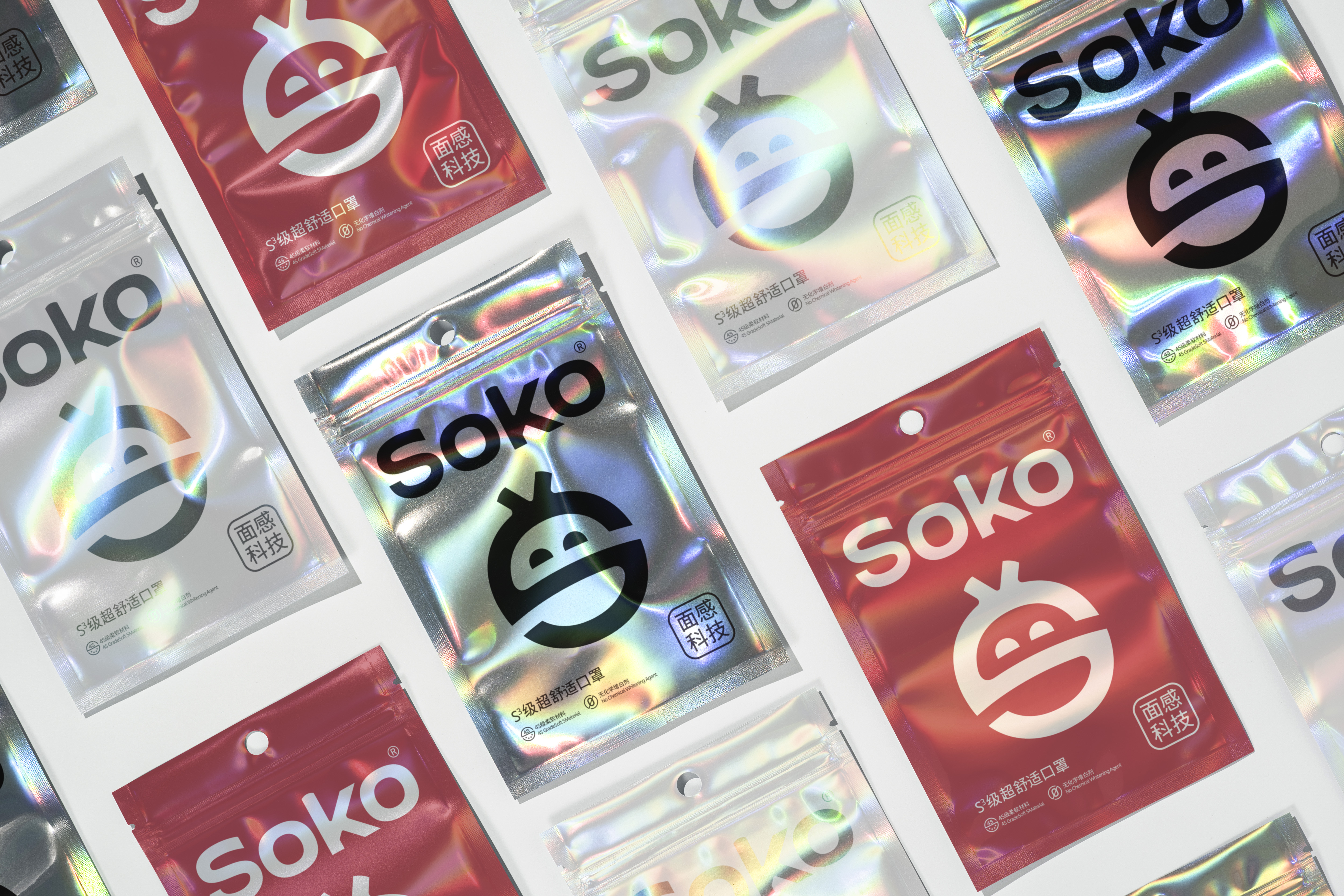
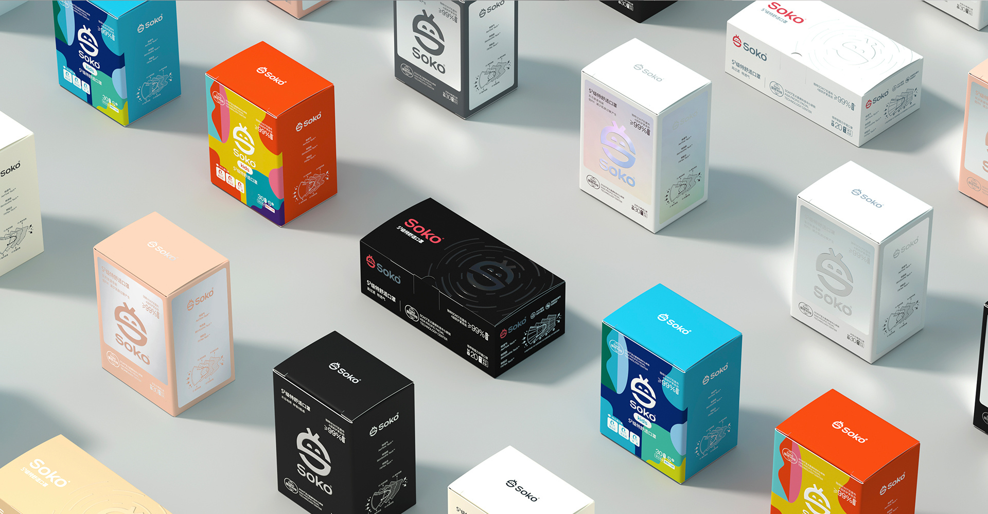
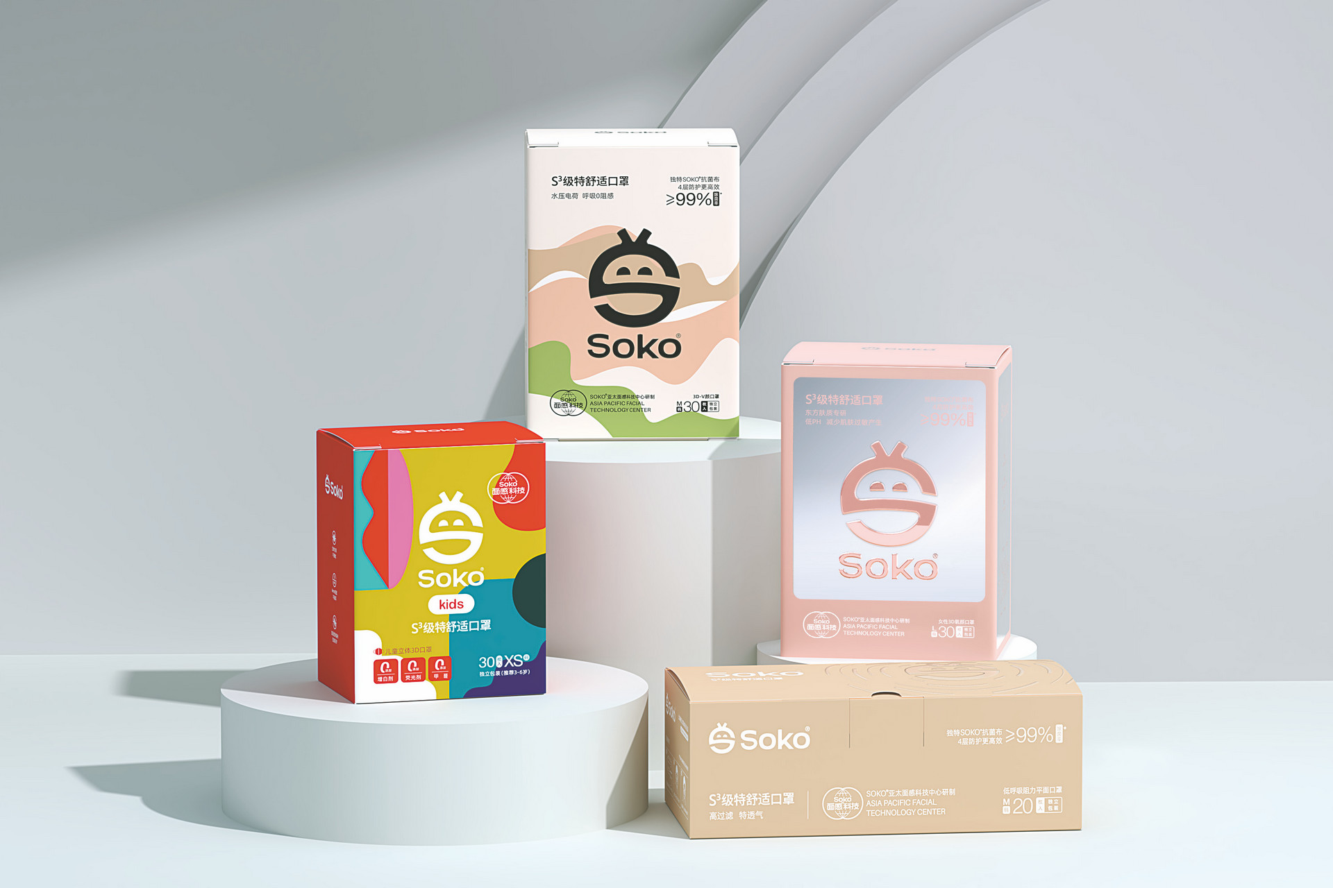
KHT integrates technology and experience in its design to systematically build a brand visual system. The logo extracts the letter "S", integrating a smiling curve and the outline of a mask to form a highly condensed symbol, which serves as the ultimate carrier of the "comfortable protection" concept. The packaging establishes a rigorous grid and visual specifications, unifying the image of multiple product lines and strengthening overall brand recognition. Colors and graphics are flexibly used within a structured framework, balancing the individuality of each series with the accumulation of brand equity. The "Soko Elf" IP image is created, with a plush, soft and dynamically derivable design, delivering the brand warmth of "focus on creating beauty" in various scenarios. KHT has built a sustainable brand growth system, transforming Soko's 15 years of dedication to comfort into a rigorous yet human-centric visual language.